Online travel booking had a $432 billion market size in 2020 and that this is estimated to hit $833 billion in 2025. (statista)
It is forecasted that Online sales will generate 73% of revenue in the travel & tourism sector by 2026. (statista)
With the number of bookings being made online only set to increase, The primary aim of this project was to Research, Design and Build a website that could effectively compete in a saturated and competitive market.
Research began with the aim of gaining an understanding of how competitors were doing things. I performed usability tests to pinpoint what competitors were doing well, not so well or anything they were not doing at all.
Pre test interviews gave some insights into what users felt was most important to them during the booking process.

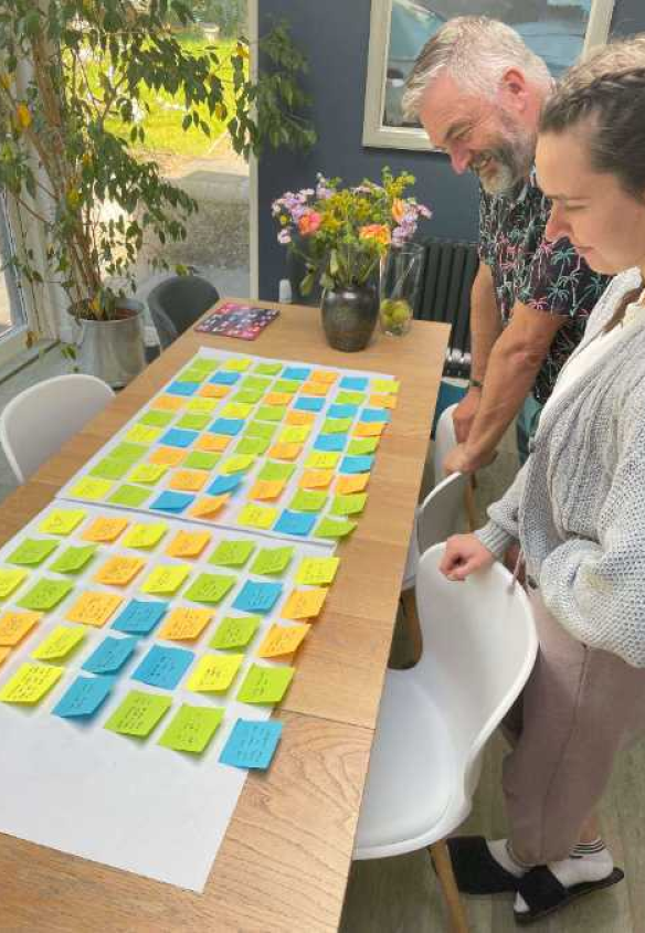
I collaborated with volunteers to create an affinity diagram. Organising the unstructured information from the usability tests into groups helped visualise where the majority of pain points were found.
The affinity diagram highlighted that most websites had clearly put effort into the UI, with users mentioning clean design and desirable graphics. However, failing to put the same effort into the UX of the site caused confusion and frustration.

Using a customer journey map I was able to visualise the emotions of the user as they progressed through the booking process. This meant I was able to evaluate which stages of the booking process were causing the most problems. Similarly to what the affinity diagram showed it was clear that after starting strongly the pain points began to build up as users moved through the competitors' sites.
“I actually may just move onto a different website”

The user flow diagram allowed me to visualise how users would interact with the website and the steps required to complete the booking process.
As the user flow had been highlighted as one of the major downfalls of competitors, I knew this step would be vital in avoiding the same mistakes to create a smooth and pain free journey.

Upon analysing the research, I identified several issues that disrupted the flow of competitors' websites. I recognized that addressing these root problems would significantly impact the success of my site design.
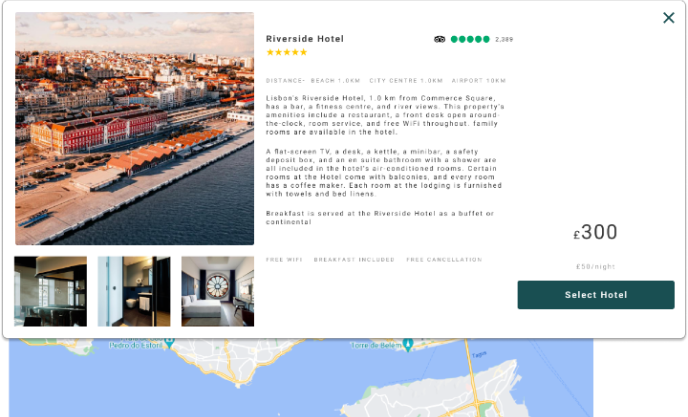
Information being hard to find or completely missing led users to be unclear on how to proceed or unsure on what they were signing up for. Ensuring all relevant information was included was the first step.
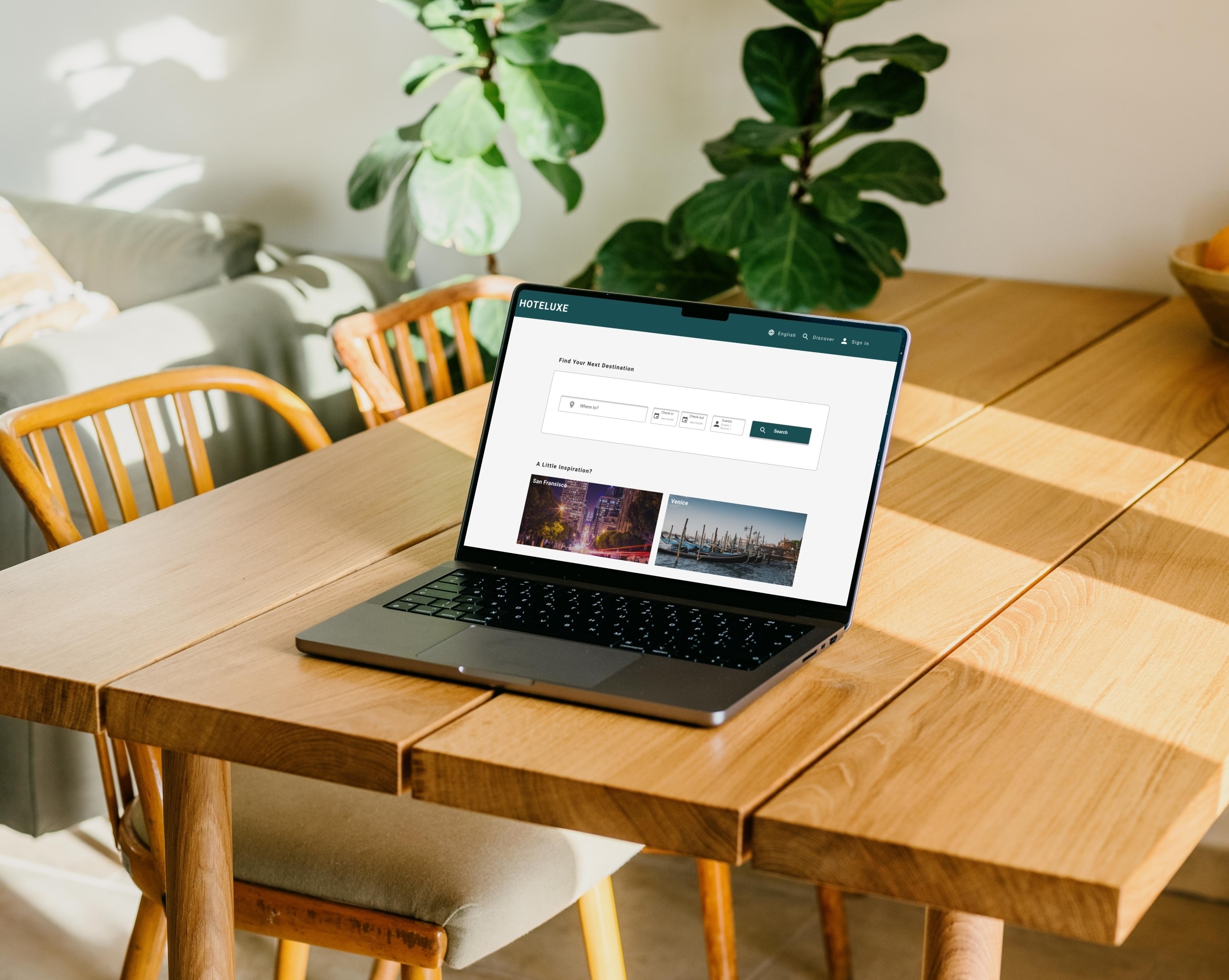
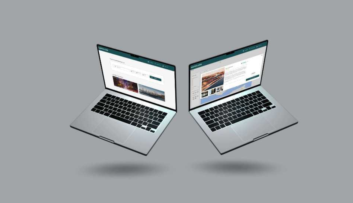
I needed to make sure that the information was clear and easily accessible. The solution was to add expanding cards with a default layout containing a snapshot of the hotel and an expanded layout going into more detail.
“I think it would be easier if they showed me a little glimpse”
Showing too much information or search results that the user deemed irrelevant also caused friction. To avoid this I added filters that were easy to use and clearly visible.

Users mentioned that the ability to compare prices was important. Comparison between hotels and rooms was evident in most of the competitors.
However, the ability to compare between multiple dates was missing. Adding the prices meant that users who were more flexible in terms of dates were given the opportunity to make savings.

Every user tested made use of a map when making their choice of hotel therefore including a map and improving its functionality was key.
“I wouldn’t know how to check if its close to the beach”

I learned during research that websites being transparent was very important to users. Not being forthcoming with what's included or the total cost were found to be major pain points.
In one usability test a user mentioned that by splitting the cost per person and not showing the total amount until the last minute felt like the website was being “Sly”
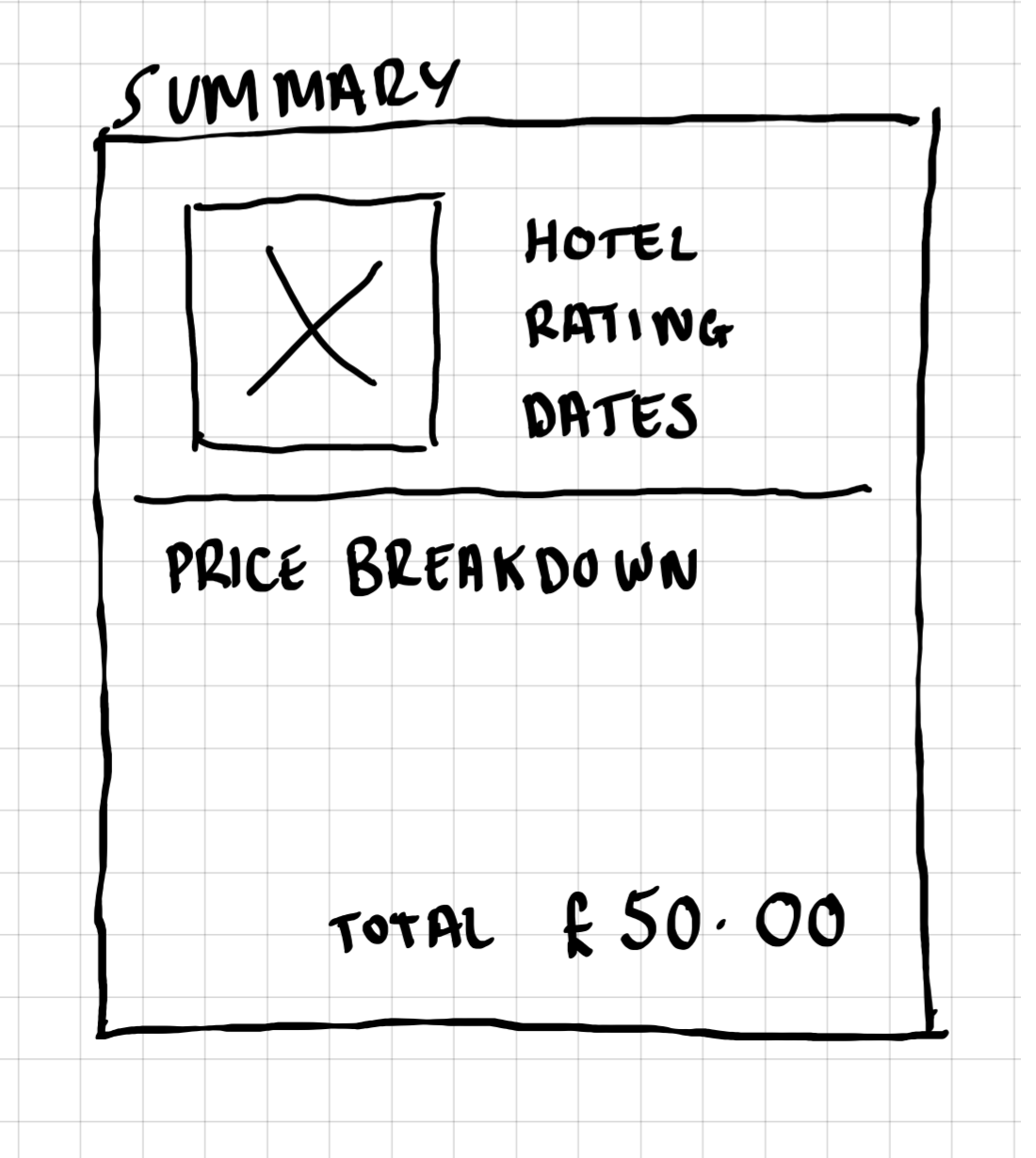

The solution to add the price of hotels during the date selection may not be the best solution. At that stage the only information to base the prices off would be the destination. The only available price would therefore be an estimation or an average of all the hotels. Not giving a true reflection of what was appropriate to the users. I believe coming up with another solution to this problem would benefit the website.
Going more in depth and including additional features to the site could improve it further. During testing users mentioned that they would like some way to find out more about the local area. This could include local restaurants, sights or upcoming events for example.
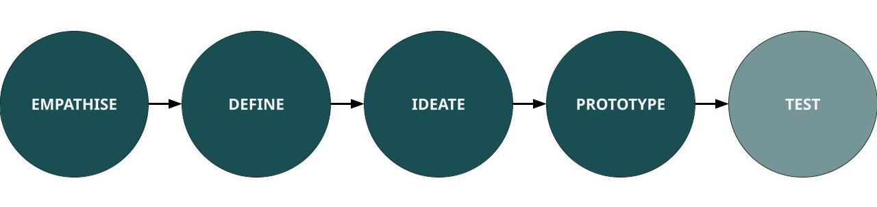
As this project was completed as part of my diploma from the UX Design Institute the final prototype was never thoroughly tested with users. In an ideal world the prototype would go through several cycles of Ideation, Prototyping and Testing.